The Psychology of Color in Design: How to Use Color Theory Effectively

The Impact of Color in Design
Color is a powerful tool in design that can evoke emotions, convey messages, and influence perceptions. Understanding the psychology of color is essential for designers looking to create impactful visual experiences.
Color Theory Basics
Color theory is the foundation of using color effectively in design. It involves concepts such as the color wheel, color harmony, and color psychology. By mastering these basics, designers can create compelling color palettes that resonate with their target audience.
Using Color to Evoke Emotions
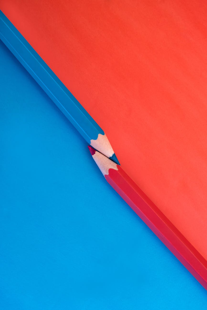
Different colors have different psychological associations. For example, blue can evoke feelings of calm and trust, while red can convey energy and passion. By strategically choosing colors based on the emotions they represent, designers can create designs that resonate on a deeper level.
Creating Visual Hierarchy with Color
Color can also be used to establish visual hierarchy in design. Bold, vibrant colors typically draw the eye first, while muted or complementary colors can be used to support or accentuate certain elements. By playing with color contrast and saturation, designers can guide the viewer's attention across a layout.
Accessibility in Design
Consideration for color accessibility is crucial in design, especially for digital products. Ensuring sufficient color contrast and avoiding color combinations that are difficult for color-blind individuals to distinguish is key to creating inclusive designs that can be experienced by all users.
Experimenting with Color in Design
Don't be afraid to experiment with color in your design projects. Whether it's through A/B testing different color schemes or exploring unconventional color combinations, pushing the boundaries of traditional color usage can lead to unique and innovative design solutions.


